
Choosing a Color Palette for Custom Window Treatments
Color can dramatically change the mood of any room and yet over 80 percent of homeowners say they struggle to match window treatments with their décor. The right palette brings light, harmony, and personality to every space, while a poor choice can leave even beautiful rooms feeling mismatched or dull. By learning how to assess lighting, balance color schemes, and test real-life samples, you can transform your window treatments into a seamless design feature that brings your vision to life.
Table of Contents
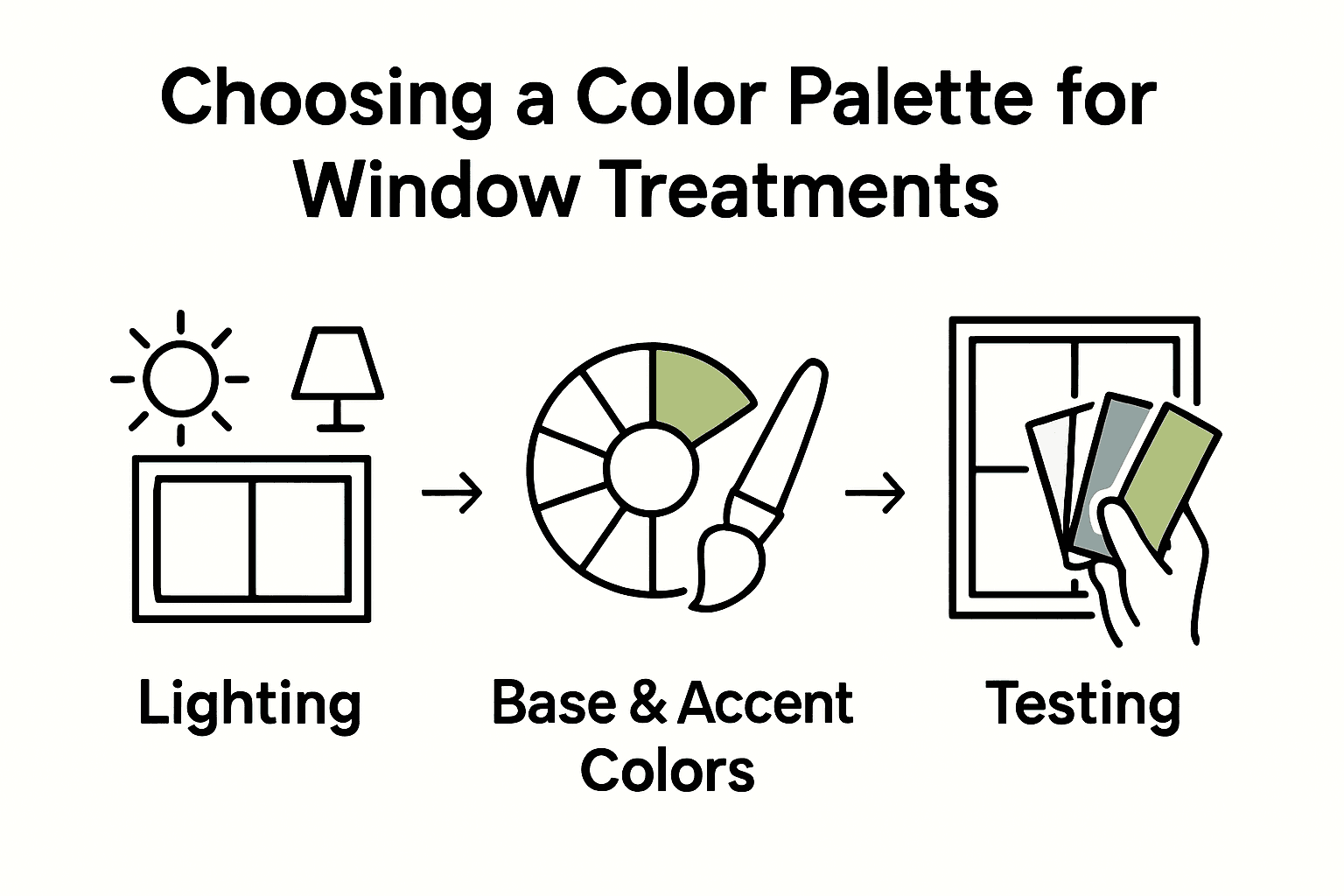
- Step 1: Assess Your Room’s Lighting And Existing Decor
- Step 2: Identify Desired Mood And Function For The Space
- Step 3: Select Base Colors That Coordinate With Key Elements
- Step 4: Integrate Accent Shades For Visual Interest
- Step 5: Test And Confirm Swatches In Your Real Lighting
Quick Summary
| Key Point | Explanation |
|---|---|
| 1. Assess room lighting and decor | Evaluate natural lighting and existing colors to inform window treatment choices. |
| 2. Consider mood and room function | Choose color palettes based on how they affect emotions and suit the purpose of each space. |
| 3. Select complementary base colors | Start with neutral colors that coordinate with existing furniture and decor for harmony. |
| 4. Introduce accent shades thoughtfully | Use 20% of window treatments for bold accents to add visual interest without overwhelming the space. |
| 5. Test swatches in real lighting | Always test fabric samples under different lighting conditions to ensure compatibility with your room. |
Step 1: Assess Your Room’s Lighting and Existing Decor
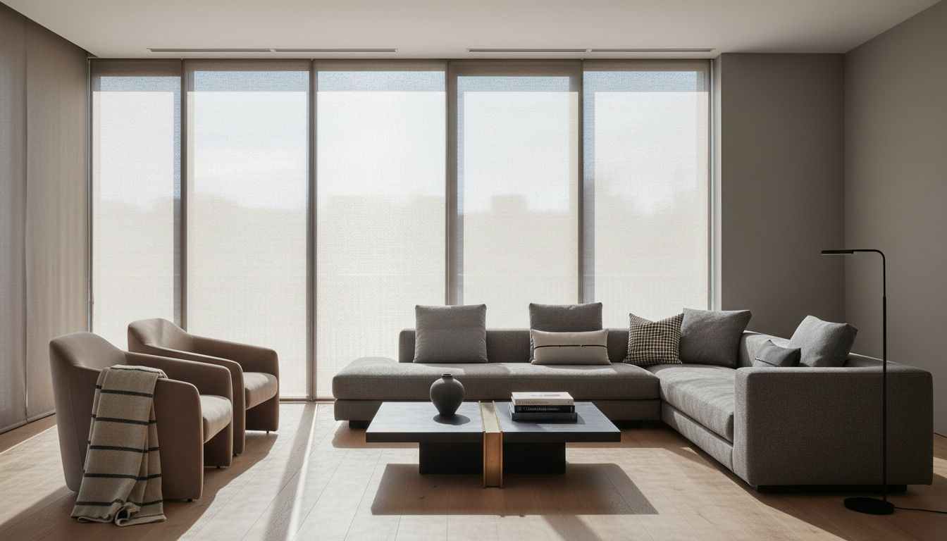
Selecting the perfect color palette for your custom window treatments starts with understanding your room’s unique characteristics. Your goal is to harmonize window treatments with existing decor while strategically enhancing lighting and visual appeal.
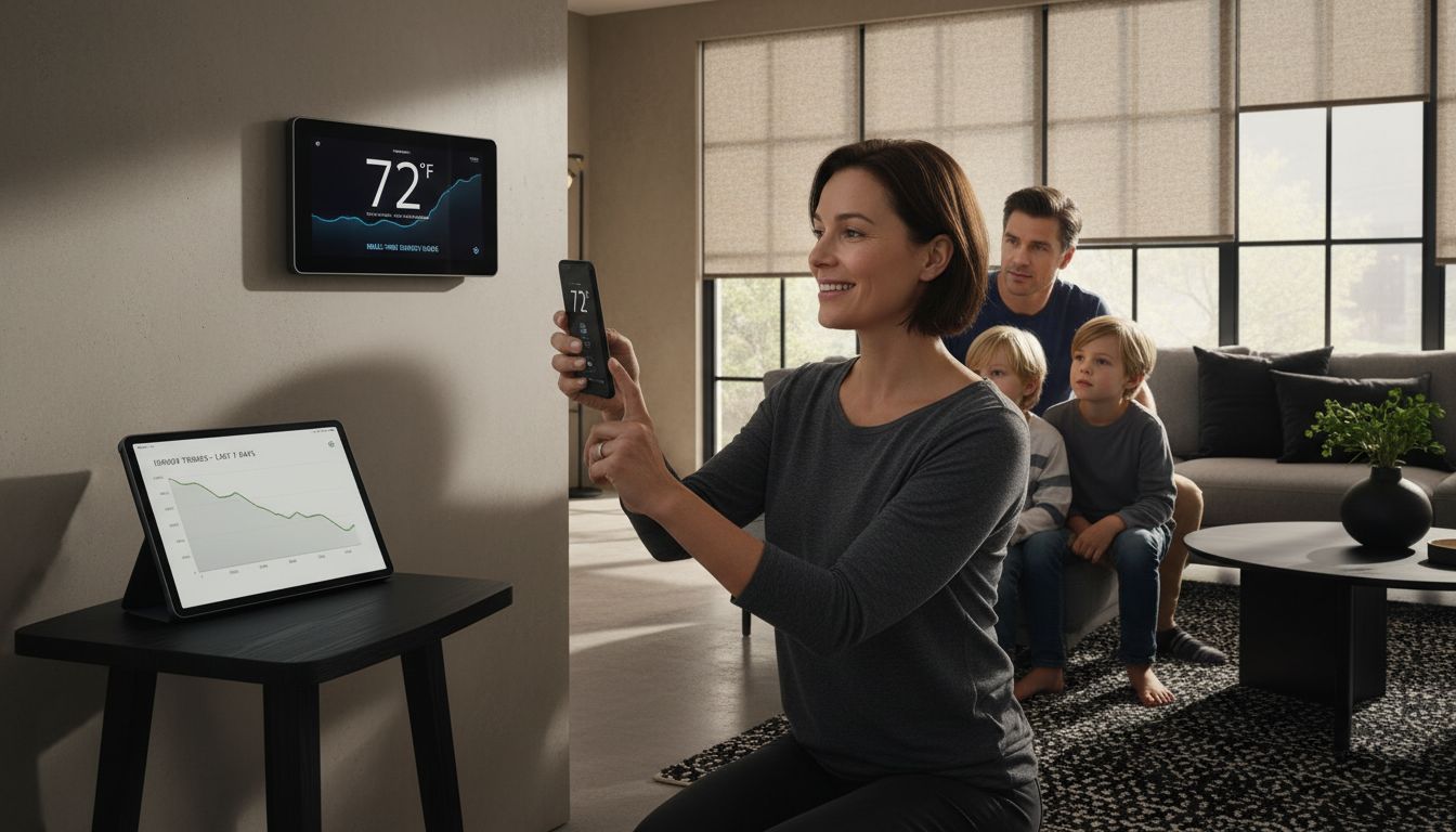
Begin by evaluating your room’s natural lighting conditions and color scheme. According to the National Institute of Standards and Technology, wall colors should range between middle lightness and white to effectively conserve light. Pro tip: pay close attention to how sunlight enters the room at different times of day. South facing rooms receive more consistent warm light, while north facing spaces tend to have cooler illumination.
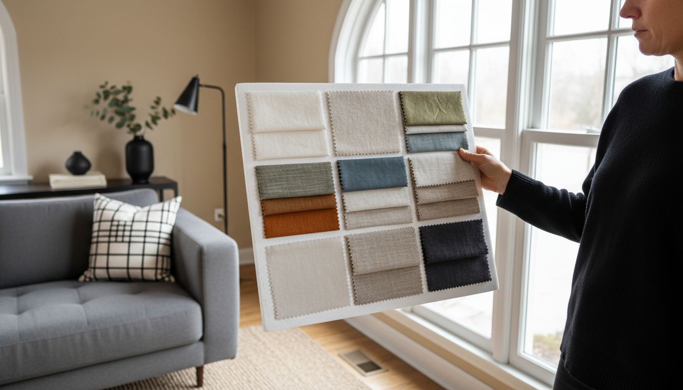
Consider your existing furniture tones and wall colors as your starting point. Research indicates that artificial lighting can dramatically alter color perception, so test color samples under your actual room lighting. Neutral shades like soft grays, warm taupes, or creamy whites work beautifully as base colors for window treatments, offering versatility and timeless elegance. Quick trick: Use a white poster board to create color test panels that you can move around the room and observe under different lighting conditions.
Next, you will explore complementary color strategies that will transform your window treatments into a cohesive design element.
Step 2: Identify Desired Mood and Function for the Space
Selecting window treatments goes beyond mere aesthetics. Your goal is to understand how color and texture can transform a room’s emotional landscape and functional performance.
Research from various design experts reveals that colors profoundly impact emotional experiences. Warm colors like red and orange can energize social spaces such as living rooms and kitchens, while cool colors like blue and green create calming environments perfect for bedrooms and home offices. Think about the primary purpose of each room before selecting your window treatment palette.
Practical considerations matter just as much as emotional resonance. Floor covering design experts recommend matching window treatment colors to room function. For high activity areas like home offices or playrooms, consider vibrant yellows or energetic oranges. In relaxation zones like bedrooms or reading nooks, opt for soft blues, gentle greens, or muted neutrals that promote tranquility. Pro tip: Always obtain fabric swatches and view them in the actual room lighting to ensure they complement your existing decor and achieve the desired emotional tone.
With your mood and function clarified, you are now ready to explore specific color palettes that will bring your vision to life.
Step 3: Select Base Colors That Coordinate With Key Elements
Coordinating window treatment colors is an art that transforms your space from ordinary to extraordinary. Your mission is to create a harmonious color palette that integrates seamlessly with your room’s existing design elements.
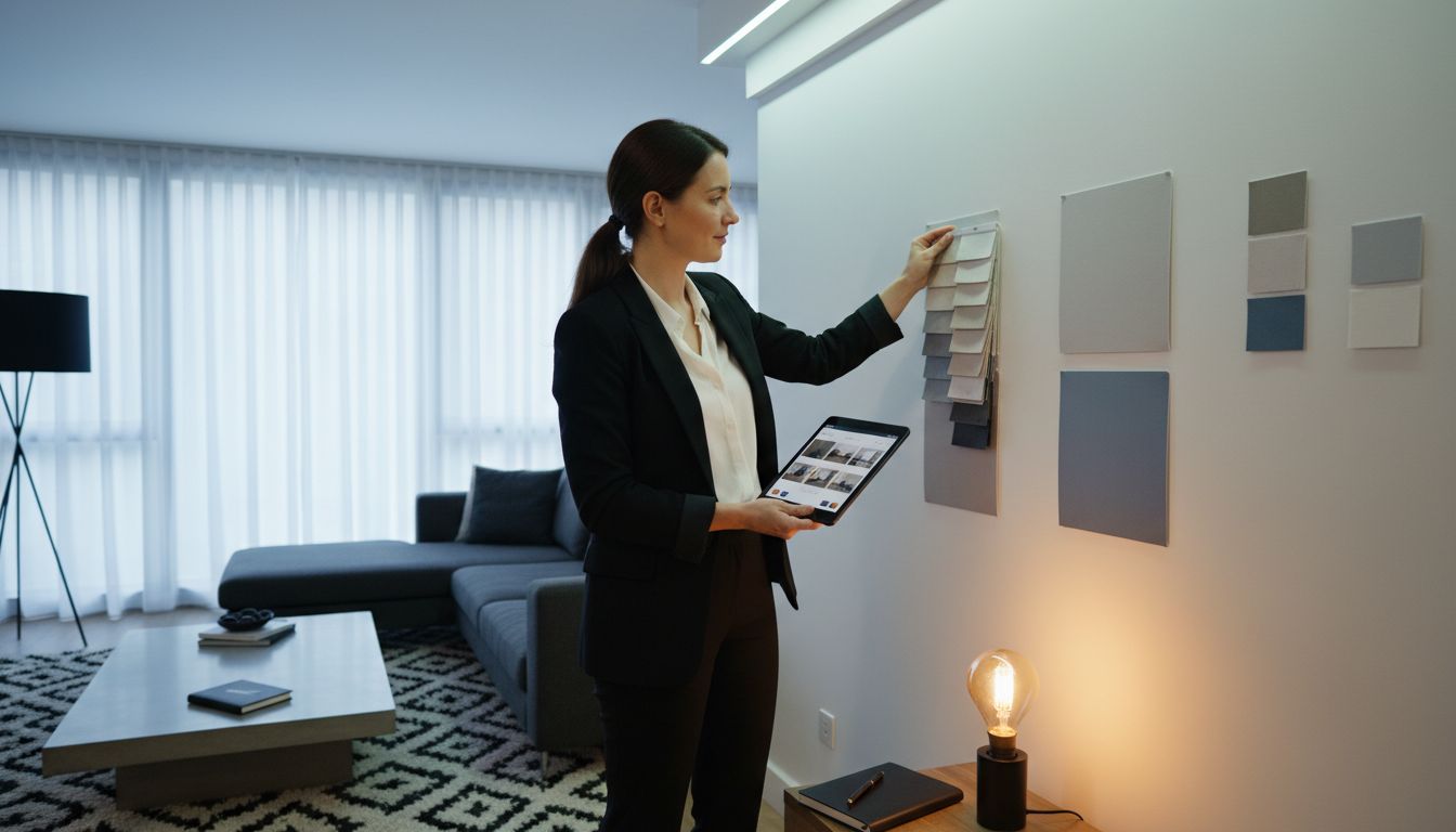
Experts at Murleys Floor Covering recommend choosing window treatment colors that complement your existing color palette. Start by taking a comprehensive visual inventory of your room. Look closely at your wall colors, furniture upholstery, flooring, and key decorative pieces. These are your anchor points for selecting window treatment colors that will create a balanced and cohesive aesthetic.
Begin with a neutral base color that bridges your existing elements. If your furniture has warm wood tones, consider soft taupe or creamy beige window treatments. For rooms with cool gray furniture, opt for window treatments in light slate or silvery tones. Pro tip: Use the 60 30 10 design rule. Choose a dominant neutral color for 60% of your space, a secondary color for 30%, and an accent color for the remaining 10%. This approach ensures your window treatments feel intentional and well integrated. By carefully selecting colors that work in harmony with your existing decor, you will create a sophisticated and thoughtfully designed space.
With your base colors selected, you are now ready to explore accent colors and layering techniques.
Step 4: Integrate Accent Shades for Visual Interest
Accent shades are the secret weapon of interior design that transform good spaces into great ones. Your goal is to strategically introduce complementary colors that elevate your window treatments from functional to fabulous.
When integrating accent shades, think of them as the exclamation point in your color story. Look for colors that are one or two steps away from your base palette on the color wheel. Explore trending window treatment styles to understand how contemporary designers are using unexpected color combinations. If your base is a soft gray, consider accent shades in muted sage green, dusty blue, or warm terracotta. These colors create visual depth without overwhelming the space.
Pro tip: Use the 80 20 rule when introducing accent colors. Dedicate 80% of your window treatment to your neutral base color and reserve 20% for bold accent elements like trim, borders, or decorative panels. This approach allows you to experiment with color without risking visual chaos. Look for opportunities in decorative trims, embroidered details, or subtle color blocking that can add personality and interest. By thoughtfully layering accent shades, you create a sophisticated visual narrative that makes your window treatments feel intentional and curated.
With your accent shades selected, you are now ready to finalize your color palette and bring your design vision to life.
Step 5: Test and Confirm Swatches in Your Real Lighting
The final and most critical step in selecting your window treatment colors is seeing them in your actual living space. No color looks exactly the same in different lighting conditions, making swatch testing an essential part of your design process.
Experts at Murleys Floor Covering emphasize the significance of considering room lighting when selecting window treatment colors. Artificial and natural light can dramatically transform color perception. To test effectively, request multiple fabric swatches and place them in different areas of your room. Observe how the colors shift throughout the day tracking changes from morning sunlight to afternoon brightness and evening ambient lighting.
Pro tip: Create a dedicated swatch board by attaching your color samples to a large white poster board. This allows you to move the board around the room and see how colors interact with your furniture, walls, and flooring under various lighting conditions. Pay special attention to how colors look near windows, in shadows, and under artificial evening lighting. Use the Privacy and Light Simulator to help visualize how different fabric colors and opacities will affect your room’s overall ambiance. By taking the time to thoroughly test your swatches, you will ensure your final window treatment color selection looks perfect in your unique space.
With your colors confirmed, you are now ready to bring your design vision to life.
Elevate Your Space with Custom Window Treatments That Perfectly Match Your Vision
Choosing the right color palette for your window treatments can feel overwhelming when balancing lighting, mood, and decor. You want window coverings that not only complement your furniture and walls but also enhance the room’s atmosphere and function. With so many factors like natural light shifts and accent colors to consider, it is easy to feel unsure which fabrics and shades will truly bring your vision to life.
At Value Blinds, we understand these challenges and provide an extensive selection of customizable blinds and shades tailored to your unique style and needs. Our free swatch service lets you see how colors perform in your real lighting before you commit. Whether you want energy-efficient cellular shades, elegant roman shades, or smart motorized options, our expert design tools and support help you create a cohesive, beautiful look that stands the test of time.
Transform your home today with window treatments designed to fit your color palette, enhance mood, and improve function. Visit Value Blinds now to explore our customizable collection and start designing your perfect window treatment with confidence.
Frequently Asked Questions
How do I assess my room’s lighting before choosing a color palette for window treatments?
Understanding your room’s lighting is crucial. Observe how natural light changes throughout the day and test color samples in various areas to see how they interact with your room’s light. Take note of whether rooms receive warm or cool light based on their orientation.
What colors should I choose for window treatments in high-activity spaces?
For high-activity areas, opt for vibrant colors like yellows or oranges to energize the space. Start by evaluating how those hues complement your existing decor to create an inviting atmosphere that caters to the room’s function.
How can I create a cohesive color design for my window treatments?
Begin with a neutral base color that matches your existing elements, like wall color or furniture tone. Aim to use the 60-30-10 rule—allocate 60% for neutrals, 30% for secondary colors, and 10% for accent shades—to ensure a balanced, well-integrated aesthetic.
What is the importance of testing fabric swatches before finalizing window treatment colors?
Testing fabric swatches is essential because colors can appear different under various lighting conditions. Collect and move swatch samples around your room to see how they look at different times of the day, paying attention to shifts in tone.
How do accent colors enhance my window treatment design?
Accent colors add visual interest and depth, helping elevate your window treatments beyond mere functionality. Introduce accents that are one or two steps away from your base color on the color wheel to create a balanced and appealing design without overwhelming the space.
What steps can I take to confirm my final color palette for window treatments?
To confirm your color palette, test your selected swatches in various locations of your room and observe their appearance under natural and artificial light. Use a white poster board to create a swatch board for easy comparison and to ensure your final choice harmonizes with your decor.
Recommended
- Custom Window Treatments - Transform Your Living Space with Style & Functionality
- 8 Modern Window Dressing Ideas for Every Home
- 7 Best Window Treatments for Bedrooms to Enhance Comfort
- 7 Creative Kitchen Window Treatment Ideas for Every Style
- Screen-kankaiden prosentit – Kuinka valita oikea valonläpäisyaste? – Nordic Blinds Oy
- Enhancing Your Mood With Window Treatments And Wellbeing


