

Article: 3 Tests That Stop Blind Color Mistakes for Homeowners
3 Tests That Stop Blind Color Mistakes for Homeowners
Match the undertone of your blinds to your dominant surface (walls, floors, or big furniture pieces), or break that rule on purpose to spotlight a focal point. Your two practical paths: blend blinds into the room so they disappear, or contrast them so they become the statement. Either way, you coordinate with what’s already there, not with a swatch card in isolation. Below, we walk through the color theory, the lighting tricks, and the room-by-room calls that make that choice easy.
TL;DR:
- Testing swatches against actual surfaces in different lighting conditions prevents color misjudgments and ensures the chosen blinds will complement the room’s undertones.
- Neutral or similar undertone matching creates a cohesive look, while high contrast can serve as a focal point but may overwhelm smaller spaces.
- Color strategies like monochromatic, analogous, and neutral with accents help coordinate blinds with room style and lighting, avoiding flat or mismatched results.
- Different rooms require specific colors: calm muted tones for bedrooms, bold contrasts for living rooms, and lighter, reflective shades for kitchens and bathrooms.
- Use free swatches and a systematic testing process before ordering, incorporating real-world lighting at different times to confirm the color choice and avoid costly mistakes.
Table of Contents
- Color Coordination Basics: Hue, Value, and Undertone
- How Light and Material Change the Way Blinds Look
- Practical Color Strategies for Coordinating Blinds
- Choosing Blind Color and Style by Room
- Patterns, Textures, and Layering With Curtains
- Common Mistakes and How to Test Samples the Right Way
- Free Swatches, Design Help, and Product Options From Valueblindsdirect
- A Quick Checklist Before You Order
- Where to Start With Value Blinds
- Sources
Color Coordination Basics: Hue, Value, and Undertone
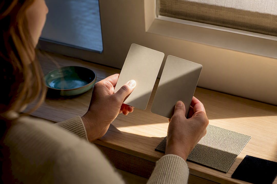
Three words do most of the heavy lifting in blind shopping: hue, value, and undertone. Hue is the color family itself (blue, green, gray). Value is how light or dark that hue sits. Undertone is the sneaky one, the subtle warm or cool cast hiding underneath a color that only shows up once it’s sitting next to your walls.
Here’s why undertone matters more than matching the exact shade: two “whites” can look completely different in the same room if one leans yellow and the other leans blue-gray. You’ll see it the moment you hold a swatch against your trim.
Before you buy anything, test against the surfaces that actually surround the window:
- Walls — hold the swatch flush against the paint, not a few feet away.
- Floors — check it in both direct light near the window and shade across the room.
- Upholstery or drapery — a sofa or rug undertone clash is more noticeable than a wall clash.
A literal color match (same beige as your walls) can look flat and matchy. An undertone match, a warm-white blind against a warm-white wall, feels intentional even if the shades aren’t identical. That distinction is the whole game. Materials and finishes vary widely across blind lines, and finish changes how a color reads, so always judge the actual swatch, not a photo of it.
How Light and Material Change the Way Blinds Look
The same blind color can look like three different products depending on when and where you view it. Direct sunlight bleaches out mid-tones and can make a warm beige look almost white by noon. Diffused, north-facing light tends to cool colors down, pulling gray or blue undertones forward. Incandescent bulbs warm everything up; LED bulbs, especially cooler-temperature ones, can flatten a rich wood tone into something closer to gray.
Material changes the story too. A woven wood blind reads warmer and more textured than a flat vinyl slat in the same “natural” color family. Matte aluminum looks softer and more neutral than glossy metal, which throws reflections that shift the apparent shade throughout the day.
Pro Tip: Tape a swatch directly to your window frame and leave it up for 48 hours. Photograph it in the morning, midday, and after dark with your lamps on. If it still looks good in all three photos, order it.
A simple at-home test sequence:
- Tape the swatch at window height, not on a table.
- View it standing at three points in the room, including your main seating spot.
- Photograph it with your phone under natural and artificial light, then compare the photos side by side.
Practical Color Strategies for Coordinating Blinds
Once you understand undertone and light, you need a strategy to actually apply it. Four approaches cover almost every room:
- Monochromatic. Pick one color family and vary only tone and texture, a cream cellular shade against cream walls, a woven wood tone that’s a shade darker than your floor. Texture keeps it from looking sterile.
- Analogous. Choose colors that sit next to each other on the wheel, sage green blinds with a blue-green sofa. This adds gentle interest without shouting.
- Complementary. Go opposite on the wheel, a deep charcoal blind against a warm terracotta wall. This works when you want the window to be a focal point, but it can overwhelm a small room fast.
- Neutrals with a pop. Keep the blind neutral and let a rug, artwork, or accent chair carry the color. This is the safest long-term bet if you repaint or reupholster often.
A rough version of the classic 60-30-10 design rule applies well here: 60 percent of the room in a dominant neutral, 30 percent in a secondary color, and 10 percent in an accent. Blinds usually fall into the 60 or 30 percent slot, rarely the accent, because covering an entire wall of glass in a loud accent color tends to dominate a room rather than punctuate it.
A few quick rules of thumb:
- Match curtains to blinds only when you want the window to visually vanish into the wall.
- Contrast curtains against blinds when you want layered depth, especially in a room with tall ceilings.
- Skip curtains entirely in rooms where the blind’s texture already carries enough visual weight.
Choosing Blind Color and Style by Room
Different rooms ask different colors to do different jobs. A bedroom wants calm; a kitchen wants durability. Here’s how that plays out:
- Bedroom. Lean toward muted, calming tones (soft grays, warm taupe, dusty blue) and consider a blackout duo-tone honeycomb shade if you want darkness plus a color that shifts subtly between day and night settings.
- Living room. This is where contrast earns its keep. Coordinate the blind with your largest furniture piece, then let a bolder color or texture create drama if the room already reads a little flat.
- Kitchen and bath. Choose materials built for humidity rather than solid wood, and favor lighter, reflective colors near sinks and cooktops where steam and grease are constant threats.
- Entryways and multi-window rooms. Unify the color across every window you can see at once from the same vantage point. Vary it only when the windows serve genuinely different rooms with different lighting needs.
The right window treatment choice always weighs looks against actual function, and that trade-off shifts room by room, not just style by style.
Patterns, Textures, and Layering With Curtains
Solid colors are the safer default, but patterned blinds earn their place when the rest of the room is calm. A patterned roman shade against plain walls and simple furniture reads as intentional. The same pattern in a room already full of patterned rugs, art, and pillows reads as chaos. Simple surroundings are what let a patterned blind actually work.
Texture changes color perception almost as much as light does. A textured woven shade has depth and shadow built into the weave, so the same “gray” reads richer than a flat, smooth fabric in identical gray.
Layering blinds with curtains works best under a few rules:
- Keep pattern scale different between the two, a small-scale blind pattern under a solid curtain, never two competing prints.
- Coordinate hardware finish (brackets, rods, valances) so the layers feel like one system rather than two mismatched purchases.
- Let one layer lead in color and the other stay neutral, never let both fight for attention.
Common Mistakes and How to Test Samples the Right Way
The three mistakes that trip up almost every first-time buyer:
- Judging a swatch under one light source only, usually the store’s fluorescent lighting, which distorts warm and cool tones badly.
- Ignoring undertone entirely and matching by name alone (“white” blinds against a “white” wall that are actually two different whites).
- Overdoing contrast in a small room, where a bold complementary color turns a window into the only thing anyone notices.
A tight three-step testing checklist:
- Order free swatches before committing to anything.
- Tape them in place and photograph the room at two different times of day.
- Live with them for at least a few days before ordering, since testing samples across lighting conditions before purchase catches problems a five-minute glance never will.
Pro Tip: If you’re torn between two shades, pick the slightly darker one. Fabric almost always looks lighter once it’s hanging with light passing through it.
Free Swatches, Design Help, and Product Options From Valueblindsdirect
Testing color decisions is easier with the right tools on hand, and Valueblindsdirect builds several into the shopping process itself. You can order free swatches from the full blinds collection to run the taping and lighting tests described above before committing to a full order.
For rooms where you’re unsure how a color or texture will actually sit, the Window Treatment Design Studio offers hands-on guidance. Cellular and roller shades suit the monochromatic and neutral-with-accent strategies, wood blinds anchor warmer analogous schemes, and motorized options add convenience without changing how the color reads. A few resources worth using early:
- Free fabric swatches for real in-room testing
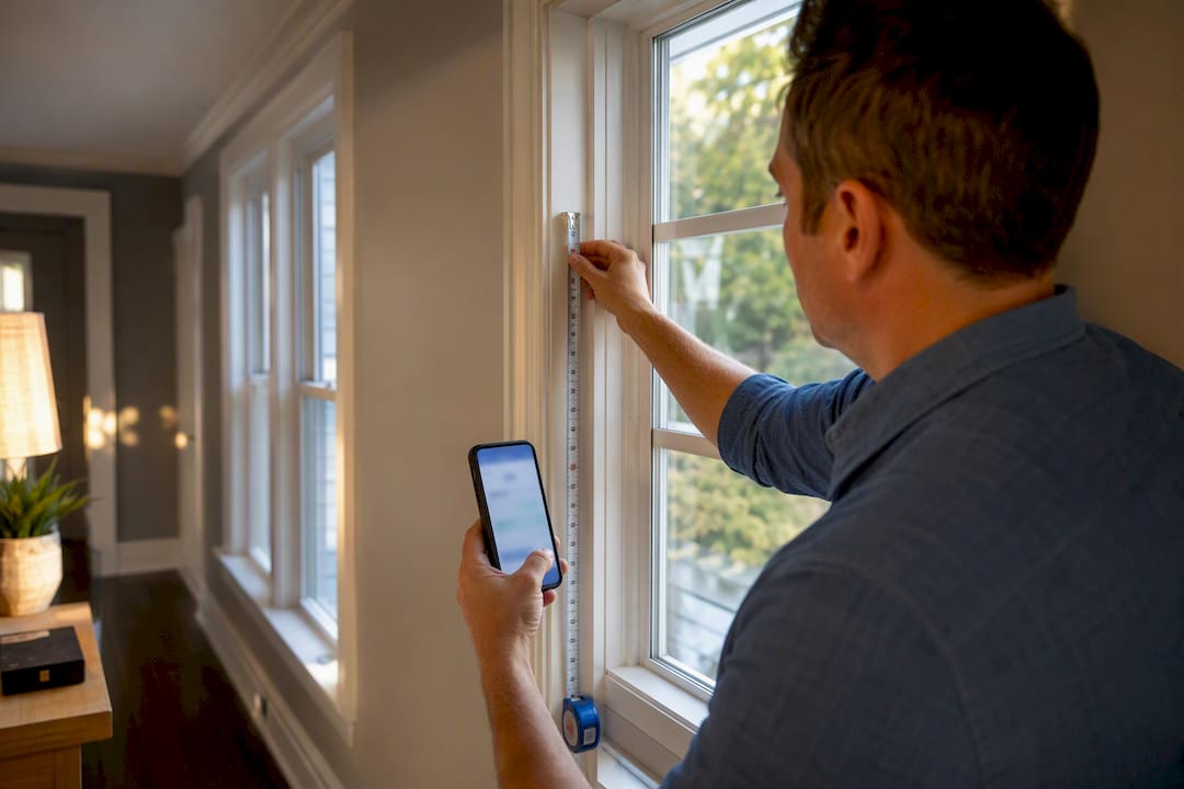
- Measurement guides to avoid sizing surprises
- Energy savings calculators for insulated cellular options
- Product warranties that back up the material choice you land on
A Quick Checklist Before You Order
Three steps cover most of what actually matters: order swatches and test them against your real walls and floors, check them under morning light and evening lamps before deciding, and pick one anchor piece in the room, whether that’s a sofa, a rug, or the flooring, and build the blind color around it rather than around a trend photo. Chase what looks timeless in your actual light, not what’s trending in someone else’s room.
— Sunny
Where to Start With Value Blinds
Valueblindsdirect gives you the testing tools this guide just walked through, not a showroom guess. Free swatches mean you’re never committing to a color based on a screen or a tiny paint chip, and the Window Treatment Design Studio walks you through material and color choices for your specific room before you spend a dollar.
If you already know your direction, browse the full blinds collection for cellular, roller, and wood options in dozens of colors, or check aluminum blinds if you’re leaning toward a cooler, more modern palette. For humidity-prone rooms, the solid wood blinds line offers the warmth of real wood where the space allows it, and vertical blinds work well for sliding doors and oversized windows. Start with a swatch order, tape a few options to your window this week, and see which one actually earns its place in the room.
Sources
For deeper detail on blind materials and installation basics, Hunter Douglas’s buyer’s guide covers finish and slat sizing. Forbes Home breaks down function-first selection, and Lowe’s buying guide covers material choices by room. For coordinating other architectural finishes alongside your window treatments, see how to match interior doors to your home’s style.




,%20or%20break%20that%20rule%20on%20purpose%20to%20spotlight%20a%20focal%20point.%20Your%20two%20practical%20path...)