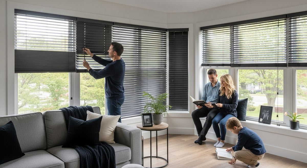

Article: Make Windows a Focal Point, Homeowners: 3 Printed Shade Moves
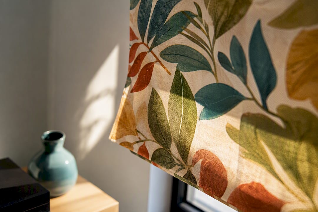
Make Windows a Focal Point, Homeowners: 3 Printed Shade Moves
Printed shades create focal points by introducing deliberate contrast in color, value, scale, or texture right where your eye naturally lands: the window. Once you understand that contrast is the engine, the rest is choice: pattern, scale, placement, and light control decide whether that contrast reads as a showpiece or as noise. Below, we’ll walk through picking the right print and hanging it so it actually works.
TL;DR:
- Bold printed shades should feature a pattern and scale that clearly stand out from the wall from a viewing distance of six to twelve feet.
- Mount the shade high and wide, extending beyond the window frame to make the window appear larger and enhance the focal point effect.
- Test fabric swatches against your window at different times of day to verify the pattern’s true color and appeal under natural daylight conditions.
- Keep surrounding decor simple and use the 70/30 rule to ensure the printed shade remains the room’s main emphasis without visual competition.
- Fabric opacity and color temperature significantly impact the mood and light quality in the room, so choose fabrics that maintain their appearance throughout different lighting conditions.
Table of Contents
- Why Printed Shades Signal a Focal Point
- How to Choose Pattern, Scale, and Color for a Statement Shade
- Placement and Framing: Mounting, Proportion, and the 70/30 Rule
- Light, Material, and Color Temperature: How Fabric Changes the Effect
- Styling Strategies and Room-by-Room Examples
- Common Mistakes and How to Fix Them
- Practical Checklist: Choose, Measure, Order, and Install
- A Design-First Take on Printed Shades
- Order Printed Shades and Get Design Support From Value Blinds Direct
- Sources
- FAQ
Why Printed Shades Signal a Focal Point
Your eye doesn’t wander randomly around a room. It hunts for the spot with the most visual difference from everything around it, and that difference is called contrast. A bold geometric or saturated botanical print on a shade gives your eye exactly that: a jump in color, value, scale, or texture that stands out against plain walls, neutral furniture, and quiet flooring.
This is what designers call emphasis, and it’s a deliberate design principle, not an accident. Emphasis works by making one element dominant enough that it organizes everything else around it, and design educators consistently advise using it sparingly so one clear feature (your shade, in this case) does the heavy lifting instead of competing with three other loud elements.
That’s also why a good focal point needs isolation. A printed shade only reads as a focal point if the pattern gets a little breathing room:
- Keep nearby patterns simple or solid so the shade doesn’t have to fight for attention.
- Give the eye a genuine resting spot, which design guidance describes as the entire purpose of a focal point.
- Use repetition thoughtfully. Echoing the shade’s color once or twice elsewhere ties the room together without diluting the effect.
Emphasis can also come from placement and isolation alone, not just bold pattern. Designers use several devices to create a dominant visual point, and a printed shade happens to combine two of the strongest: it sits in a naturally prominent spot (the window) and it can carry pattern that nothing else in the room replicates.
How to Choose Pattern, Scale, and Color for a Statement Shade
Getting this right comes down to three decisions: what the pattern is, how big it reads, and how saturated the color runs. Get any one of them wrong and the shade either disappears into the wall or overwhelms the room.
1. Match pattern scale to the window size and viewing distance. A tiny print on a large picture window reads as texture from across the room, not as pattern. As a rule of thumb, small-scale prints suit narrow or close-up windows, while windows viewed from six to twelve feet away need a larger repeat to register as intentional pattern rather than a smudge.
2. Use saturation and temperature to set the mood. Saturated, high-contrast prints act like accents; they demand attention and work well in living rooms or entryways where energy is welcome. Warmer palettes (rust, ochre, terracotta) feel grounding and cozy. Cooler palettes (indigo, sage, slate) feel calmer and more restrained. Choose based on the mood you want the room to hold, not just what looks good on a swatch card.
**3. This single move is what separates a shade that feels planned from one that feels like it wandered in from a different house.
4. Test before you commit. Order swatches and hold them against the actual window at different times of day. What looks bold under store lighting can go flat or garish under afternoon sun.
Pro Tip: Photograph your swatch against the window at 9 a.m., noon, and dusk. If the color still reads true in all three, you’re safe to order.

Value Blinds Direct’s design studio lets you preview pattern and scale digitally before you spend money on samples, which is a fast way to rule out the prints that only work in theory.
Placement and Framing: Mounting, Proportion, and the 70/30 Rule
Where and how you hang a printed shade matters almost as much as the print itself. A striking pattern mounted too low or too tight will still underperform.
Mount high and wide. Hanging the shade closer to the ceiling and extending it a few inches beyond the window frame on each side makes the window look larger and gives the pattern more surface area to make its case. This is a simple staging trick, but it’s the one homeowners skip most often.

Frame the print instead of letting it float. Simple trim, a pelmet, or slim side panels give the eye a boundary, which reinforces the isolation that makes a focal point work. Without framing, even a great pattern can feel like it’s spilling into the wall.
Decide dominance with the 70/30 rule. Interior design commonly leans on a 70/30 balance between a calm base layer and a bolder accent layer. If you want the shade to support a fireplace, art piece, or architectural feature instead, tone the print down so it doesn’t compete for the same spotlight.
Choose inside vs. outside mount deliberately:
- Inside mount gives a cleaner, more architectural look and works well when the window trim itself is attractive.
- Outside mount hides imperfect trim, makes the window appear larger, and gives the pattern more visible fabric.
- For a true focal-point effect, outside mount usually wins because it maximizes the printed surface area on display.
Light, Material, and Color Temperature: How Fabric Changes the Effect
The fabric behind the print does more work than most homeowners expect. Translucency decides whether the pattern glows softly during the day or disappears once the shade is lowered against bright glare, and that changes how the focal point actually behaves at different hours.

Fabric color and openness also shift the color temperature of the daylight passing through, which affects the mood of the whole room, not just the window. Research on woven screen fabrics found that darker, tighter-weave fabrics tend to push transmitted daylight toward a cooler correlated color temperature (CCT), while lighter, more open fabrics shift it warmer. That means a dark, dramatic print might make the room feel a shade cooler in daylight than a lighter print with a similar pattern.
Statistic snapshot: Fabric openness and darkness aren’t just about privacy and glare. The same fabric properties that block light also bend the correlated color temperature of what gets through, which is a lever most homeowners never consider when picking a print for mood rather than just looks.
If you want to preserve an outdoor view along with the print’s impact, choose a shade with enough openness to keep sightlines while still carrying the pattern clearly. Test this the same way you’d test color: hang the sample, and watch the room at morning, midday, and evening light before you decide the fabric is right.
Styling Strategies and Room-by-Room Examples
The same principles play out differently depending on the room, mostly because of scale, distance, and how much the space already competes for attention.
-
Living room. Scale the print to your seating arrangement, not just the window. A large-scale geometric or floral reads clearly from a sofa eight feet away, and repeating one of its colors in a throw or lamp shade ties the whole seating group back to the window without duplicating the print itself.
-
Bedroom. Softer, larger-scale florals or muted geometrics support rest, while a darker, more saturated print can create real drama if you want the window wall to feel intentional and bold rather than restful. Either direction works, as long as the bedding and nightstand décor stay quiet.
-
Kitchen. Smaller-scale botanical or geometric prints suit kitchens because sightlines are usually shorter and the shade sits closer to countertops and backsplash tile. Pull one accent color from the shade into a runner or a set of dishware, and the window stops looking like an afterthought.
-
Dining room. This is where bold, vertical, or oversized botanical prints earn their keep. A dramatic shade behind the dining table acts almost like a stage backdrop, especially when the table itself and the chairs stay simple. It’s one of the few rooms where a genuinely theatrical print rarely feels like too much.
Across every room, the same core idea holds: pick one dominant printed element, then let everything else in the sightline support it quietly.
Common Mistakes and How to Fix Them
Even a great print can fail if the surrounding choices work against it. Watch for these:
- Busy neighbors. A bold shade next to a patterned rug and a printed accent chair creates visual competition instead of a focal point. Simplify one of them.
- Undersized pattern on a large window. A delicate small-scale print on an eight-foot picture window reads as texture, not pattern, from across the room. Size up the repeat or add framing to concentrate the eye.
- Color that shifts under different light. A print that looked warm in the store can turn cool and flat by a north-facing window. Test swatches at multiple times of day before ordering.
- Competing with architecture. A dramatic shade next to a fireplace or a statement staircase can split attention. Choose a calmer print, or move the drama elsewhere in the room.
Pro Tip: If two elements in the same sightline are both “loud,” mute one. A room can usually only support a single true focal point at a time.
Practical Checklist: Choose, Measure, Order, and Install
Once you’ve settled on the design direction, the process itself is straightforward if you take it step by step.
- Pick your pattern scale and ground color, then order free swatches to confirm the look in your actual room rather than trusting a screen.
- Decide inside vs. outside mount based on whether you want a cleaner architectural line or a larger visual footprint for the print.
- Measure width, height, and reveal depth carefully, adding any mounting allowance your chosen bracket style requires.
- Check motorization or cordless options if the shade will be hard to reach or you want smart-home control alongside the design upgrade.
- Review warranty and return details before finalizing your order, especially on a bold custom print you can’t easily swap later.
A few extra notes worth keeping in mind:
- Value Blinds Direct’s measurement guide walks through inside and outside mount measuring step by step.
- If you’re not confident measuring a large or oddly shaped window, the Pro Measure & Install service removes that risk entirely.
- Always double-check swatch color against your window at different times of day before finalizing the order. It’s a five-minute step that prevents most regrets.
A Design-First Take on Printed Shades
The advice that consistently works isn’t complicated: pick one printed element to be loud, keep everything around it quiet, and test the fabric against real daylight before committing. Homeowners who skip that last step are the ones who end up disappointed, not because the pattern was wrong, but because they never saw it under their own window’s actual light.
What surprises people most is how much fabric openness and color depth affect mood, not just brightness. A shade isn’t only a pattern choice; it’s a light filter for the whole room. Start with the print you love, then verify it with swatches and a design studio preview before it becomes eight feet of fabric you’re stuck with.
— Sunny
Order Printed Shades and Get Design Support From Value Blinds Direct
Getting the contrast, scale, and color right on paper is one thing. Seeing it against your actual window is another, and that’s exactly the gap Value Blinds Direct closes for you. Instead of guessing from a swatch card or a screen, you can preview real patterns in your own space and order the exact custom fit your window needs.
Start with the Window Treatment Design Studio to test pattern scale and color combinations before you buy anything. Order free swatches so you can run the daylight test we covered earlier, right against your own glass. When you’re ready to measure, the measurement guide walks you through inside and outside mount decisions, or you can hand the whole job to the Pro Measure & Install team if you’d rather skip the tape measure entirely. Once you’ve settled on a print, browse the full shade and blind collection to place your order.
Sources
For readers who want the design theory behind this article, BYU–Idaho’s art110 materials explain contrast as a perceptual mechanism, VDCI’s design principles guide covers emphasis and scale in depth, Kansas State University’s extension fact sheet breaks down focal point rules simply, and the 2022 fabric transmittance study explains how fabric affects light and color temperature.
- Contrast and focal points — BYU–Idaho art110 materials
- Design principles: harmony, scale, proportion, balance, rhythm — VDCI
- Focal points explained (extension service fact sheet) — Kansas State University
FAQ
What Are Three Ways to Create a Focal Point?
The three most reliable methods are contrast (a printed shade against plain walls), placement (mounting it high and centered in a sightline), and isolation (keeping nearby decor simple). Design guidance also lists scale and repetition as supporting tools.
What Is the 70/30 Rule in Design?
The 70/30 rule suggests keeping 70% of a room in calm, neutral tones and reserving 30% for bolder accents like a printed shade. It helps you decide whether your shade should dominate the room or simply support another feature.
How Do You Create a Focal Point With a Printed Shade?
Choose a pattern with enough contrast in color, value, scale, or texture to stand apart from the surrounding walls and furniture, then keep nearby decor simple so the eye has nowhere else to land. Mounting the shade high and wide adds further emphasis.
What Design Principle Creates a Focal Point?
Emphasis is the principle at work: it uses contrast and placement to make one element dominant while everything else supports it. Design educators recommend applying emphasis sparingly so it stays effective.
Does Value Blinds Direct Offer Tools to Preview Printed Shades?
Yes. Value Blinds Direct’s design studio lets you preview patterns digitally, and free swatches let you test color and print scale directly against your window before ordering. Current pricing for individual shade styles is available on the product pages.