
How Shades Complement Furniture Tones: A Practical Guide
Shades complement furniture when they share its undertone (warm, cool or neutral) or deliberately contrast with it in value and texture. Find the undertone of your biggest wood or upholstered pieces first, then choose a shade color and material that echoes it, softens it or balances it. Simple, right? Let’s walk through how. 🪟
TL;DR
- Check your furniture’s undertone in daylight against white paper before you pick a shade color. Showroom or evening bulbs will fool you.
- Warm woods (oak, cherry, honey pine) love creams, warm whites, sand and soft earth tones. Cool or gray woods pair with crisp whites, greige and muted blue-grays.
- You don’t have to match exactly. Match the undertone, then vary the shade slightly lighter or darker so the window doesn’t blend into the furniture.
- Texture does half the work: woven, honeycomb or linen-look shades give smooth furniture something to play against.
- Order swatches and hold them next to your actual furniture at different times of day before you commit.
Table of Contents
- Start with undertone, not the color name
- How to read your furniture’s undertone
- Which shade colors work with which furniture tones
- Match or contrast? When each approach works
- Mixing several wood tones in one room
- Use texture to complement, not copy
- Room-by-room examples
- Common mistakes to skip
- A simple five-step routine
- Our perspective
- Find your match with Value Blinds
- FAQ
- Sources
Start with undertone, not the color name
Most “it just looks off” moments come from undertone. A sofa and a shade can both be “beige” and still fight each other, because one leans yellow and the other leans pink or gray.
Sherwin-Williams color marketing director Sue Wadden explains that the mass tone is what you see first, but the undertone decides how a color harmonizes with everything around it. That’s the whole game with shades and furniture. You’re not choosing a color in isolation. You’re choosing a partner for what’s already in the room.
Three families cover nearly everything:
- Warm: yellow, orange, red or golden-brown leanings (oak, cherry, mahogany, honey pine, camel leather, cream upholstery).
- Cool: gray, ash, taupe, blue or purple leanings (weathered oak, ash, gray-washed finishes, slate or charcoal fabric).
- Neutral: balanced browns and greiges that don’t lean strongly either way (many walnut finishes, mushroom and stone fabrics).
How to read your furniture’s undertone
You don’t need a design degree. Try these checks, ideally all of them.
The white paper test
Hold a sheet of bright white printer paper next to the wood. Warm woods look yellow, orange or pink against the white, while cool woods read gray, ash or taupe. The same guide suggests doing this in indirect natural light around midday, not under showroom lighting.
The shadow and crease test for fabric
For upholstery, look at the darkest parts. Warm undertones show up in shadow as golden, brown or amber, and cool ones as gray, blue or purple. Fold a loose swatch or look inside a seat cushion seam and you’ll see it quickly. Textured weaves like boucle, linen and velvet make these shadows even more obvious.
Check it at different times of day
Light changes everything. Wadden notes that blue northern light emphasizes blue undertones, while golden southern light makes colors look creamier. Evening bulbs matter too: one color resource points out that oak can turn frankly orange under warm evening lighting, which is a very common complaint. So check your furniture and your shade swatch in morning light, afternoon light and with your lamps on.
Our 3 tests that stop blind color mistakes go deeper on this if you want a step-by-step routine.

Which shade colors work with which furniture tones
Here’s a quick cheat sheet. Treat it as a starting point, then trust your swatches.
| Furniture tone | Shade colors that flatter it | Why it works | Materials to try |
|---|---|---|---|
| Warm wood (oak, cherry, honey pine) | Cream, warm white, sand, soft camel, muted terracotta | Shares the yellow or red undertone, so the room feels cozy and connected | Natural woven shades, cellular shades in warm neutrals |
| Dark warm wood (mahogany, espresso) | Ivory, oatmeal, soft gold, deep olive | Lighter shades give dark pieces breathing room; deep greens echo the richness | Roman shades, light filtering roller shades |
| Cool or gray wood (ash, weathered oak) | Crisp white, greige, pale gray, dusty blue | Keeps the cool palette clean and airy | Roller shades, faux wood blinds, zebra shades |
| Neutral walnut or mushroom tones | Almost anything: soft white, stone, charcoal, muted green | Balanced undertone is the most flexible partner | Wood blinds, roman shades, zebra shades |
| Black or charcoal furniture | White, light gray, or a bold accent such as deep green | Contrast keeps heavy pieces from feeling cave-like | Vertical blinds, aluminum blinds, solar shades |
| Colorful upholstery (navy, emerald, rust) | Neutral shades that pick up the lightest tone in the fabric | Lets the furniture be the star | Roller shades, cellular shades |
Warm furniture
Warm wood plus warm shade colors is the easy, cozy route. Designers who write about wood tones say that pairing warm woods with warm-undertone colors like yellows, oranges and reds feels harmonious and inviting, but you can get the same effect more subtly with creams and sand. If you love the natural look, a woven wood shade brings its own warm, organic grain that sits beautifully beside oak or pine.
Cool furniture
Gray-washed or ash furniture goes quiet and modern with a crisp white or pale gray shade. Avoid cream with a strong yellow lean here, because it can make the cool wood look dingy by comparison. A soft dusty blue can add a little calm color without clashing.
Neutral furniture
Lucky you. Neutral browns and greiges accept both warm and cool shades. This is where you can get more playful: a deep green roman shade, a subtle stripe, or a zebra shade with a gentle two-tone pattern.
Match or contrast? When each approach works
Both are valid. The question is what you want the window to do.
Go tonal (close match) when:
- The room is small and you want it to feel calm and bigger.
- You have lots of different furniture pieces and need one steady backdrop.
- You want the shade to disappear and let the view or the furniture shine.
Go contrasting when:
- Your furniture is very dark or very light and the window needs to balance it.
- You want the window to be a feature (a patterned or richly colored roman shade, for example).
- The room is already neutral and needs a spark.
A good rule: share the undertone, differ in depth. If your sofa is a mid-tone warm taupe, a shade one or two steps lighter in a warm cream looks deliberate. A shade that is almost exactly the sofa color can look like you tried to match and missed.
If you want the window to be the star, our guide to printed shades as focal points shows how.
Mixing several wood tones in one room
Most real rooms have a coffee table that doesn’t match the media console that doesn’t match the floor. That’s fine. Designers often suggest keeping the undertones consistent across the wood pieces rather than forcing identical finishes. A common approach is the “rule of threes”: roughly three wood tones in a room, sharing a warm, cool or neutral leaning.
Where do shades come in? They can be the piece that ties it together. Pick a shade that echoes the lightest or the most common tone in the room. Natural bamboo or woven shades can act as another “wood” in the mix, while a painted or fabric shade can calm things down if the wood is already busy.

Hardware helps too. Designers quoted by Livingetc advise that cohesive hardware and hems that kiss the floor help varied window treatments look coordinated. Consistent finishes on cords, wands, brackets and valances keep different shade types looking like one family.
Use texture to complement, not copy
Tone is half of it. Texture is the other half. One interior design guide describes tactile contrast as the main secret to combining textures, and it keeps rooms made of only smooth or only plush surfaces from feeling flat.
Try these pairings:
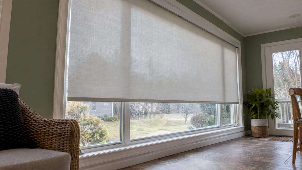
- Smooth, glossy wood furniture + woven or linen-look shade: the texture softens the shine.
- Plush velvet sofa + sleek roller or solar shade: clean lines keep the room from feeling heavy.
- Rustic reclaimed wood + soft roman shade: fabric folds tame the rough edges.
- Painted or lacquered pieces + natural bamboo: a touch of nature warms them up.
- Mid-century walnut + faux wood or solid wood blinds in a close tone: a tidy, intentional look.
Want to see how fabric shades play with light and style? Our guide to fabric shades covers it, and the overview of wood blinds for windows helps if you’re thinking of echoing your furniture with real wood.
Room-by-room examples
These are illustrative ideas, not rules carved in stone.
Living room with a warm oak coffee table and camel leather sofa
Go for a warm white or sand roller or cellular shade. Add a woven shade in a natural tone on a second window if you want some texture. Keep the hardware in a soft brass or a neutral finish.
Bedroom with dark espresso furniture
Dark furniture can feel heavy at night, so lighter shades in ivory or oatmeal balance things. If you need darkness for sleep, choose a blackout option in that light tone rather than a very dark fabric.
Dining room with a gray-washed table
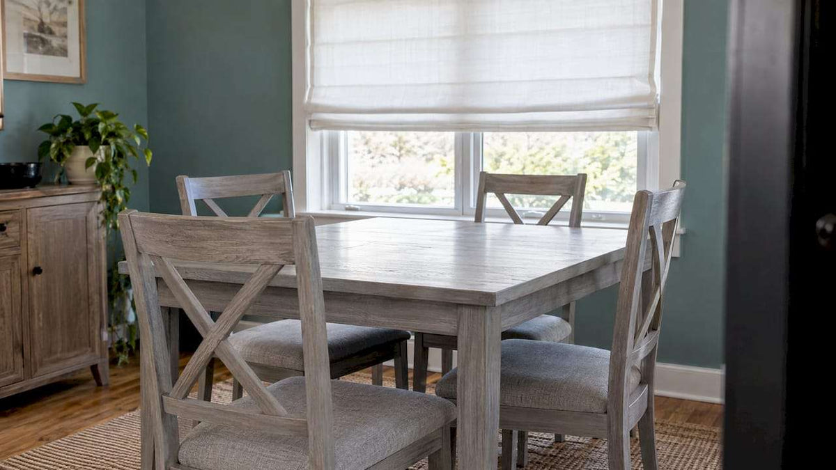
A crisp white or light gray roman shade keeps the look fresh. A dusty blue stripe can add a little personality. Linen-look textures stop the palette from feeling cold.
Home office with walnut desk and shelving
Walnut is flexible. Try a zebra shade (the alternating sheer and solid bands let you tune light for screens) in a soft greige. Or go with wood blinds in a similar warmth for a library feel.
Sunroom with mixed rattan and painted furniture
Natural bamboo or woven shades fit the organic mood. A solar shade can cut glare on bright days while keeping the view.
For a wider look at styles room by room, see our 5 window treatment families and room-by-room picks.
Common mistakes to skip
- Choosing from a screen. Colors on a monitor shift. Always use a physical swatch.
- Ignoring the light direction. A north-facing room will pull colors cooler. A south-facing room will warm them up.
- Matching the wall color and ignoring the furniture. Walls can be repainted; your sofa probably won’t be. Start with the biggest furniture pieces.
- Mixing undertones randomly. A warm cream next to a cool gray sofa is a common clash.
- Forgetting function. Beautiful color doesn’t help if the room needs privacy, light control or heat reduction. Pick the style first, then tune the opacity.
Our color palette guide for custom window treatments helps you build a full scheme.
A simple five-step routine
- Identify your anchor piece: the largest or most expensive furniture item in the room.
- Find its undertone: white paper test in daylight, then check it with lamps on.
- Pick a family: warm, cool or neutral shades that share that undertone.
- Decide match or contrast: go one or two steps lighter or darker for depth.
- Test swatches: tape them to the window and live with them for a day or two across morning, afternoon and evening.
Our perspective
At Value Blinds, we think of a shade as the finishing layer on a furniture plan, not an afterthought. The undertone of your wood and upholstery should guide the color, and the material should add the texture your room is missing.
That’s why we offer such a wide range of styles, from roller, zebra and cellular shades to roman, woven, bamboo, solid wood and faux wood options. Our design aims to give you flexibility to match a warm oak room, a cool gray one or a mix of both, with options like blackout, cordless and motorized for the way you actually live.
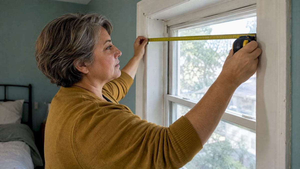
We also encourage you to start with free swatches and our measurement guides so you can see the real thing next to your real furniture. A good match feels effortless, and we love helping you get there. 😊
Sunny
Find your match with Value Blinds
Ready to put this into practice? Browse our full range of custom blinds and shades, from cellular and roman shades to wood and bamboo blinds. You can order free swatches, hold them up to your sofa and side tables, and use our Window Treatment Design Studio to preview your look.
If you’d like help with sizing, our professional measuring and installation service takes the guesswork out of fit. Start with our roman shades for pattern and softness, or our solid wood blinds to echo your furniture’s grain.
FAQ
Should my window shades match my furniture exactly?
No. Aim to share the same undertone (warm, cool or neutral) while varying the depth by a step or two. An exact match can look flat or look like a near-miss, while a coordinated difference looks intentional.
What color shades go with dark wood furniture?
Lighter, warm neutrals like ivory, oatmeal and soft sand balance dark wood and keep the room from feeling heavy. If your dark wood has a cool undertone, try crisp white or pale gray instead. Deep olive or forest green can also look rich with espresso or mahogany.
How do I know if my furniture is warm or cool toned?
Hold white printer paper next to it in indirect daylight. If the wood looks yellow, orange or pink against the paper, it’s warm. If it looks gray, ash or taupe, it’s cool. For fabric, check the shadows in the folds: golden or amber means warm, slate or blue means cool.
Can I mix wood blinds with furniture in a different wood finish?
Yes, as long as the undertones are compatible and you vary the tones on purpose. Mixing a few wood tones in one room is normal. Keeping hardware and finishes consistent helps the whole look feel coordinated.
What texture of shade works best with smooth furniture?
Woven, linen-look and honeycomb textures add contrast to smooth, glossy or lacquered pieces. Tactile contrast keeps a room from feeling flat, so let the shade bring the texture your furniture doesn’t.
Sources
- Understanding Undertones to Choose the Right Color (Sherwin-Williams)
- How to Find the Undertone of Your Wood Furniture (Patch Decor)
- Color Undertones Explained (Fabric Resource)
- Working With Wood Tones (Colourwise)
- Should All Your Window Treatments Match (Livingetc)
- How to Combine Textures in Decor (Mebeltops)